


Category Archives: Uncategorized
Monster box

Persona
Our audience is for boys ages 5-7.
 This attracts our audience because of the clear packaging showing the toy and the complex round shape.
 This image is good for our audience because of the bright red colors and the different jagged shape.
 This product will attract our audience because it has bright colors and a cool explosive design on the box.
 This is good for our audience because of the clear packaging and cool colors.
 This is good for our audience because it has a clear packaging and cool colors.
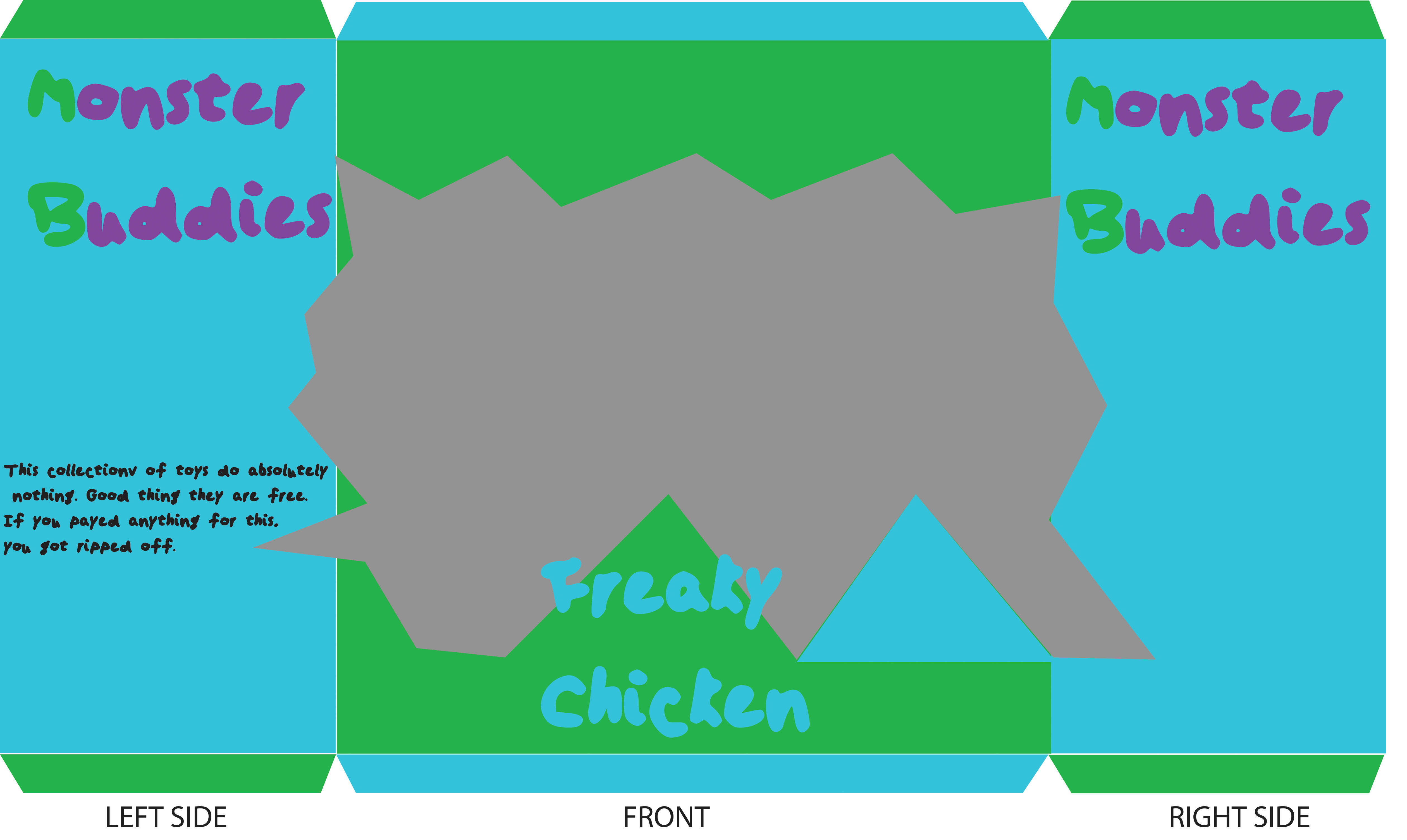
Toy Packing
1. This toy is intended for small girls because of the bright pink colors, the sparkles on the box, and the fact that it sais for ages 3+.
2. The package on the bottom uses bright colors that pop out at you while the one on the top uses darker classy colors.
3. When I was a kid, I remember that most of the toys I wanted were kept in bright colored packagers. They were usually from tv shows I watched. The packages were also located low enough on the shelf so I could grab them.
Independent Projects t4


Photos
Group Shots

Head Shots

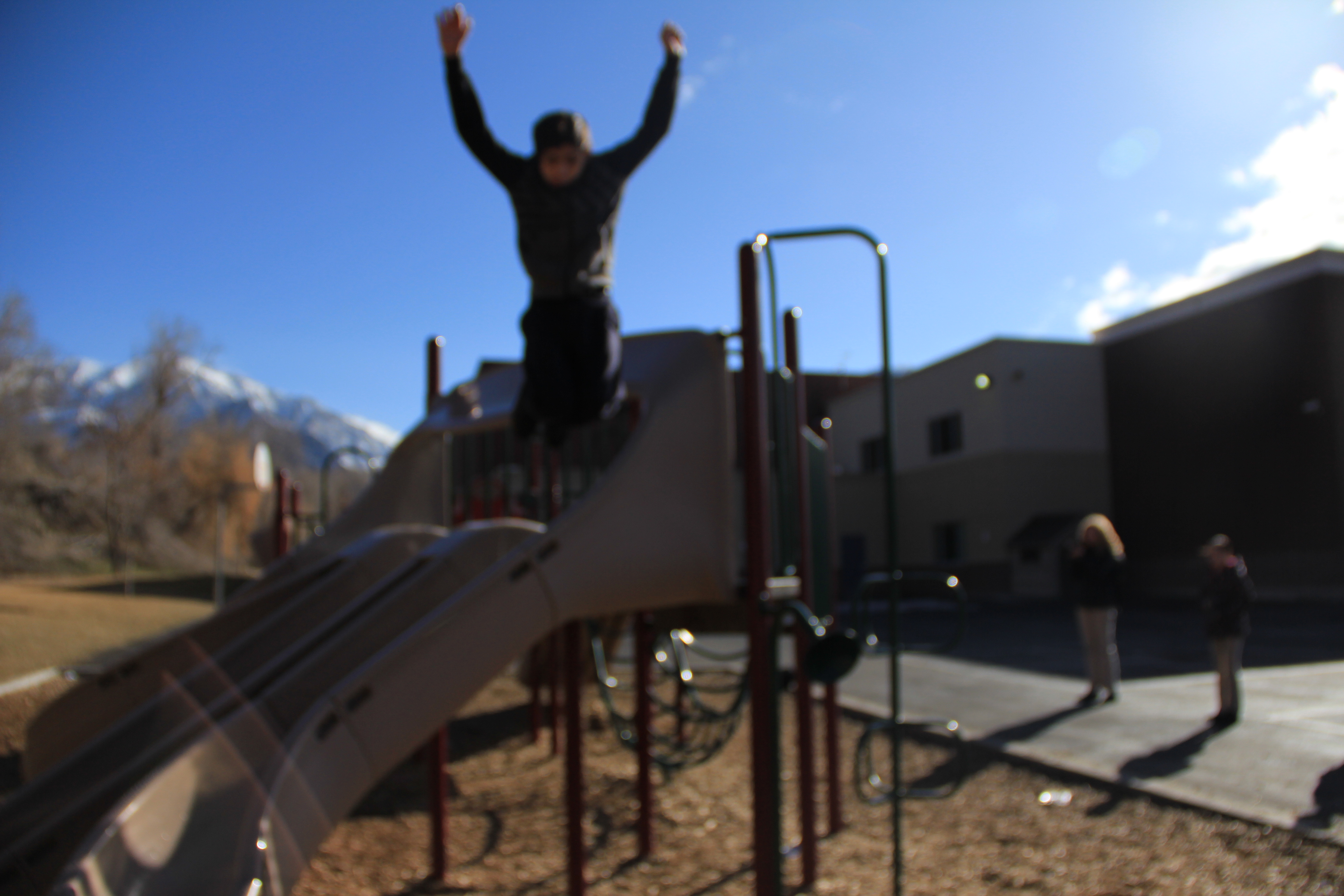
Long Exposure

Motion Shots

Macro Shots

Trademark Colors
1. Teal Jewelry
2. Ups
3. Post It
4. John Deere
5. Home Depot
6. T-Mobile
7. Target
8. Cat
Composition Basics
I think the picture is well balanced because the light colors do not overpower the cool colors. The use of the colors is used differently throughout the picture. The cool colors are on the bottom and top of the picture in the water, sky, and most of the board walk. The hot colors are in the middle of the picture in the small town in the background. The boardwalk is the use of leading lines in the picture. You follow the boardwalk until the end and find the town at the finish.

What is Photography?
Photography is art through frozen images that depict a certain message. It allows people to express different ideas without using words.
Shutter speed pictures
These pictures have a high shutter speed
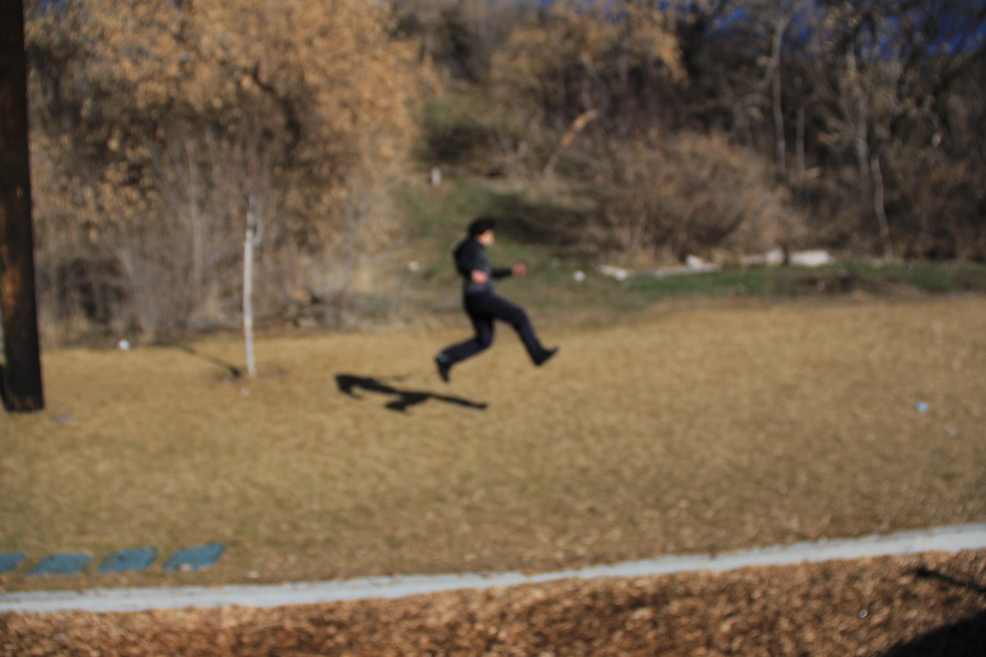
These pictures have a low shutter speed

